On paper, these two styles shouldn’t work together. One is rooted in nostalgia, weathered signage, and rural imagery. The other is often stark, modern, and completely untethered from any specific time or place. But put a faded vintage flag piece next to a bold geometric abstract painting, and something interesting happens. They don’t clash the way you’d expect. They actually give each other more presence.
Why These Two Styles Seem Like an Odd Pair
Americana leans heavily on narrative. A weathered barn, a vintage road sign, a faded flag — these pieces tell you something, or at least hint at a story. Abstract art usually does the opposite. It’s non-representational by definition, more about mood, color, and shape than any specific reference point.
That contrast is exactly why the pairing works when it’s done well. One style gives a room some history and warmth. The other gives it a sense of movement and modern energy. Used together thoughtfully, they stop a space from feeling like it’s stuck entirely in the past or entirely in the present.
What Makes the Combination Work
Contrast Creates Interest
A room filled with only one style, no matter how good that style is, can start to feel a little flat after a while. Mixing Americana’s warmth with abstract art’s boldness gives a space more visual range. Your eye has more to explore instead of settling into one predictable mood.
Shared Boldness, Different Expression
Both styles can be bold, just in different ways. Americana gets its boldness from color and nostalgia — a saturated red, white, and blue palette, a striking vintage graphic. Abstract art gets its boldness from shape and composition — strong lines, unexpected color blocking, dramatic scale. Because both styles are confident rather than quiet, they end up complementing each other’s energy instead of one making the other look out of place.
It Keeps Heritage Style From Feeling Dated
Americana on its own, especially in a heavily themed room, can start to feel more like a period piece than a lived-in modern home. Pairing it with abstract art keeps things feeling current. The abstract piece acts almost like a bridge, connecting the nostalgic elements to the rest of a contemporary space.
How to Actually Mix Them in a Room
Let One Style Take the Lead
Just like mixing any two bold styles, it usually works best when one clearly leads and the other supports. A large vintage-inspired Americana piece as your main focal point, paired with a smaller abstract piece elsewhere in the room, keeps things balanced rather than competing.
If you’d rather have abstract art lead, flip it. A bold geometric or color field piece as the centerpiece, with a smaller, more subtle Americana element (a vintage-style sign, a muted flag piece) adding a bit of warmth and history without overwhelming the space.
Separate Them Spatially
Give each piece its own wall if you can, or at least enough distance that they read as two intentional choices rather than one confusing mashup. Hanging them directly side by side tends to look more accidental than curated.
Find a Color Bridge
This is probably the most important trick. Look for a color that shows up in both pieces, even faintly. A muted red in your Americana piece and a similar rust tone in your abstract painting creates a visual thread that ties the whole room together, even though the styles themselves are pretty different.
If you’re drawn to the nostalgic, story-driven side of this pairing, a collection of Western art gives you a good sense of the range available — from bold, graphic vintage pieces to quieter, more weathered options that are easier to pair with something more modern.
Choosing the Right Abstract Piece to Pair
Not every abstract style pairs equally well with Americana. Loud, chaotic gestural pieces can sometimes fight with Americana’s already-strong color and imagery. A calmer, more restrained abstract piece tends to work better as a counterbalance rather than adding more visual noise on top of visual noise.
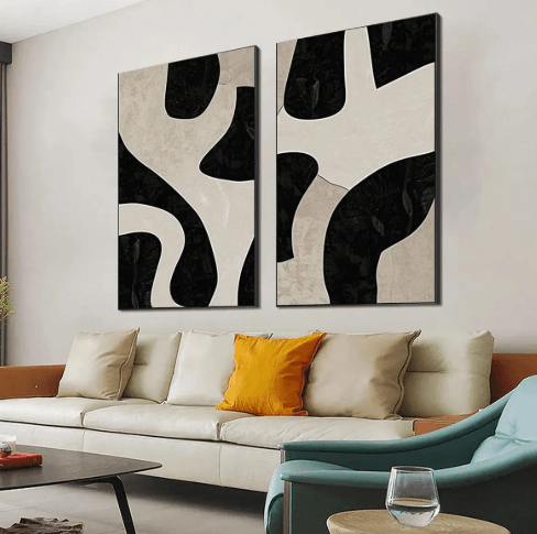
Muted, neutral-leaning abstract pieces are often the easiest starting point, since they let the Americana piece keep most of the color and personality in the room. Browsing a collection of neutral abstract art can help you find something that adds shape and interest without competing directly with a bolder vintage-inspired piece nearby.
Room-by-Room Pairing Ideas
Living Room
A large Americana piece above the sofa as the main statement, paired with a smaller, more neutral abstract piece on an adjacent wall or above a side table. This keeps the warmth and nostalgia front and center while the abstract piece adds a bit of modern balance.
Home Office
Flip the lead role here. A bold, energizing abstract piece behind your desk, with a small vintage typography or sign-style Americana piece elsewhere in the room for a touch of character without becoming distracting during work hours.
Dining Room
Dining spaces can actually handle a bit more boldness from both styles at once, since they’re used for shorter periods of time compared to a living room or bedroom. A striking Americana piece on one wall and a bold abstract piece on another can create a genuinely dynamic, conversation-starting space.
What to Avoid When Mixing These Styles
Choosing two equally loud pieces for the same wall. This is the fastest way to make a room feel chaotic instead of intentional. Let one lead.
Ignoring color connection entirely. Without some shared tone between the two pieces, the pairing can feel more like two unrelated purchases than a cohesive design choice.
Overcrowding the room with too many pieces from each style. One strong piece from each category usually says more than three or four scattered around competing for attention.
Forgetting about the furniture and decor around them. Busy patterned textiles combined with two bold art styles can push a room past interesting and into overwhelming pretty quickly. Keep the surrounding decor a little quieter if your art is already doing a lot of visual work.
See also: Streamlining Operations in Vacation Rental Management Businesses
FAQ
Do Americana and abstract art need to share the same color palette to work together?
Not exactly, but having at least one shared or related tone between them makes the pairing feel more intentional. A completely unrelated color story between the two pieces can make the room feel disjointed rather than curated.
Which style should be the focal point of the room?
It depends on the mood you want. Americana as the lead creates a warmer, more nostalgic feel. Abstract as the lead keeps things feeling more modern and energetic. Neither is wrong, it just changes the overall tone of the space.
Can this combination work in a small room, or does it need a lot of wall space?
It can work in a small room, as long as you scale down. One smaller piece from each style, rather than two large statement pieces, keeps a small space from feeling crowded while still getting the benefit of the contrast.
Mixing heritage style with modern abstract art isn’t about forcing two opposites into the same space. It’s about letting each one do what it does best — one bringing warmth and story, the other bringing energy and movement — and giving them enough room to actually work together instead of against each other.